

Stop designing for your ego and start designing for your client’s panic. Most firms treat their website as a digital trophy case. They ask for marble columns, aggressive suits, and dark mahogany textures. But the person on the other end of that page — facing a DUI, a divorce, or a personal injury — is not browsing for luxury goods. They are frightened.
Key Takeaways
- Your visitor is usually in crisis, not comparison shopping. Design for that state, not for the partner’s pride.
- Speed is the first trust signal. A hero video pushed one firm’s mobile load to six seconds; cutting it brought the page down to 0.8 seconds.
- Calming navy and soft white outperformed aggressive red and black in a split test across two Newport Beach personal injury firms.
- Swap passive copy like “Learn More About Us” for a direct action such as “Free Case Evaluation” or a one-tap call.
- Keep the phone number in a sticky, thumb-friendly click-to-call bar instead of burying it in the footer.
The money sits in a different starting question: what does a frightened person need in the first ten seconds on the page? We call the answer psychological triage.
A high-converting site works like an ER intake desk, not a corporate boardroom. The goal is to bring the visitor’s anxiety down and offer a clear path to safety within about three seconds of the page loading.
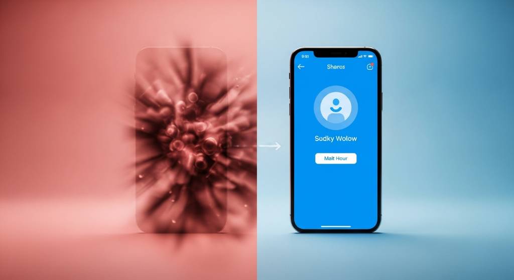
The 3-Second Rule
If your site spends five seconds loading a 4K video of a skyline, the lead is already gone. When someone is in crisis, every extra second of waiting is another second to hit back and try the next firm on the list. Speed and clarity beat prestige aesthetics whenever the visitor is under stress.
Engineering Calm in the Chaos
To run psychological triage, strip away the prestige clutter: aggressive pop-ups, heavy parallax scrolling, and autoplay video that pile onto an already overwhelmed reader. Build instead for immediate trust.
Color and Typography
Color does a lot of work before anyone reads a word. Aggressive reds and blacks are common in law because they signal power, but to a traumatized client they can signal danger.
- Avoid: high-contrast red and black themes.
- Adopt: blues, greens, and soft whites, which read as trust, calm, and clarity.
- Typography: use highly legible, accessible fonts. Your reader is probably on a phone, possibly from a hospital or a police station.
The Red vs. Blue Trust Experiment
In a split test across two personal injury firms in Newport Beach, we found something counter-intuitive about color.
We ran an A/B test on landing pages targeting “Truck Accident” keywords. Version A used traditional, aggressive red and black branding. Version B used a navy blue and soft white palette.
The result: Version B saw a 22% higher form completion rate. Red reads as a warning; blue reads as stability. Visual trust outperforms visual aggression when the reader is looking for a savior, not a soldier.
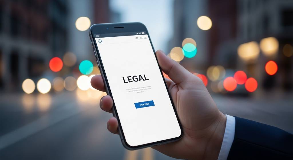
Prestige vs. Triage Models
Here is the traditional ego-based design next to the triage-based approach.
| Feature | Old school (prestige model) | Triage model (our approach) |
|---|---|---|
| Hero imagery | Lawyer with arms crossed, marble background. | Empathetic imagery with clear “we can help” context. |
| CTA strategy | “Learn More About Us” (passive). | “Free Case Evaluation” or “Call Now” (action). |
| Mobile UX | Cluttered, slow-loading video elements. | Thumb-friendly, one-tap dial, under one second to load. |
| Content tone | “We are aggressive warriors.” | “We take the burden off your shoulders.” |
The Conversion Gap on Mobile
The shift in design philosophy shows up directly in lead volume. Lowering the intimidation factor captures transactional intent faster. Lead conversion rate on mobile traffic:
- Traditional prestige design: 1.2%
- Psychological triage design: 4.8%
The Local Search Reality
Someone in Los Angeles searching for “DUI Lawyer” on a 4G connection will bounce off a heavy, prestige-focused site. That bounce is a lead the firm down the street just inherited.
The Friday Night DUI Disaster
I once audited a high-profile firm in West Hollywood spending $50,000 a month on PPC with a conversion rate hovering near 1%. Their site opened with 4K drone footage of the LA skyline.
The problem: people were hitting the site on phones over spotty 4G on Friday nights. The video took six seconds to load. In that window, the panic-stricken visitor bounced back to Google.
We applied the triage fix. We scrapped the video on mobile, added a sticky emergency call bar, and changed the headline to “Arrested? Speak to an Attorney in 60 Seconds.” Mobile load speed dropped to 0.8 seconds, and call volume rose 315% in the first 30 days.

How This Plays Out in Practice
Here is the same idea applied across different practice areas.
Scenario A: Personal Injury (San Diego)
Before: dark site, gold text, video of a gavel slamming, high bounce rate on mobile.
After: white and blue theme, a “Free Ride Home” offer front and center, simple contact form.
Result: 40% increase in form fills.
Scenario B: Family Law (Sacramento)
Before: long paragraphs about the lawyer’s law school awards.
After: a triage layout built around protecting your children and asset security.
Result: better-qualified leads, and clients who felt understood before the first call.
Do not bury your contact info. Use a sticky footer on mobile so people can click to call instantly. That is a core piece of digital marketing services in California, where the competition is fierce.
Common Myths in Legal Web Design
Plenty of firms cling to habits that work against them.
- Myth: “I need to look expensive to charge high rates.”
Reality: you need to look competent. Expensive often reads as unapproachable to a stressed client. - Myth: “Stock photos of handshakes work.”
Reality: real photos of your team build more trust than generic stock assets.
The Ego Wall vs. The Help Desk
I worked with a family law firm in San Francisco where the managing partner wanted his awards front and center. We ran a heat-mapping test. Visitors scrolled straight past the awards, rage-clicking on terms like “Child Custody.” We moved the awards to the About page and gave the homepage over to client pain points. The bounce rate dropped from 65% to 42%.
Design for the Anxious Mind
If your site does not lower the visitor’s blood pressure in the first few seconds, you are handing that person to the competitor who does. Web design for lawyers is about empathy and speed, not vanity.
Audit your mobile load speed today. Make sure your phone number is a clickable button, not an image. Design for the anxious mind first, and everything else in your marketing gets easier.
Frequently Asked Questions
What is psychological triage in law firm web design?
It means treating the website like an emergency room intake desk instead of a corporate boardroom. Someone arriving after an arrest, an injury, or a divorce filing is panicking, not shopping for luxury. The design job is to lower that panic and show one obvious path to help within about three seconds, using plain language, fast pages, and an unmistakable way to reach a human being.
Why do calming colors work better than red and black on a legal site?
Color does its work before anyone reads a word. Red and black get chosen to project power, but a frightened visitor can read them as danger instead. In a split test across two Newport Beach personal injury firms, a navy blue and soft white landing page beat the traditional red and black version on form completions. Blue reads as steady when someone is looking for help.
How fast does a law firm website need to load on mobile?
Treat roughly three seconds as the ceiling, and faster is better. One West Hollywood firm ran 4K skyline footage that took six seconds to arrive over spotty Friday night 4G, and panicked visitors bounced back to Google before the page finished. Cutting the video from the mobile layout brought load time down to 0.8 seconds. Speed is the first trust signal a stranger gets.
Should a law firm homepage use a hero video?
Rarely, and almost never on mobile. Heavy video, parallax scrolling, and autoplay motion are prestige clutter that costs load time and adds noise for someone who is already overwhelmed. Replace the video with an empathetic still image, a headline that names the visitor situation, and a single action such as a free case evaluation or a one tap call.
Where should contact details go on a law firm website?
Everywhere the thumb already is. Do not bury the phone number in a footer or lock it inside an image. A sticky click to call bar on mobile lets a visitor dial without hunting, and the number should be a real clickable button. Pair it with a short contact form for the people who cannot safely talk on the phone at that particular moment.
Do awards and credentials still belong on a law firm website?
Yes, but not in the hero. At a San Francisco family law firm the managing partner wanted awards front and center, and heat mapping showed visitors scrolling straight past them to rage click on terms like child custody. Moving the awards to the About page and giving the homepage over to client pain points brought the bounce rate down.