
Most attorneys believe their clients are looking for prestige. They assume that mahogany desks, leather-bound books, and lists of accolades are the keys to winning business. They are wrong.
Key Takeaways
- People hire a lawyer while under acute stress, so a site that reduces cognitive load will out-perform one that signals status.
- The phone is the crisis channel: most legal searches happen on mobile, often from a roadside or a waiting room on a weak connection.
- A heavy hero video is the most common speed problem on an attorney site; a static hero with one clear call action loads far faster.
- Navigation written in plain English, such as Divorce Help and Child Custody, beats legalese like Marital Dissolution and Paternity Actions.
- Local signals, meaning real local imagery, LocalBusiness schema, and an embedded map, tie the firm to the city it actually practices in.
Someone searching for a lawyer is usually in a state of fight-or-flight. Whether they have been injured in an accident or arrested, they fit what we call the high-cortisol user profile: cognitively narrowed by stress, with very little patience left over for your website.
If your site adds to that load with complex navigation or slow load times, they bounce. If it takes stress away through clear UX and a bit of empathy, they convert. That is the core of the Emotional De-Escalation Framework.
The Pillars of De-Escalation UX
Designing for a law firm takes a shift in perspective. You stop designing for the lawyers and start designing for the person in trouble. That starts with color and architecture.
Aggressive blacks and reds, common in criminal defense branding, can read as danger. Navy blues, forest greens, and generous white space read as stability and air. Past the aesthetics, though, the site has to work like a triage unit.
Mobile-First is Crisis-First
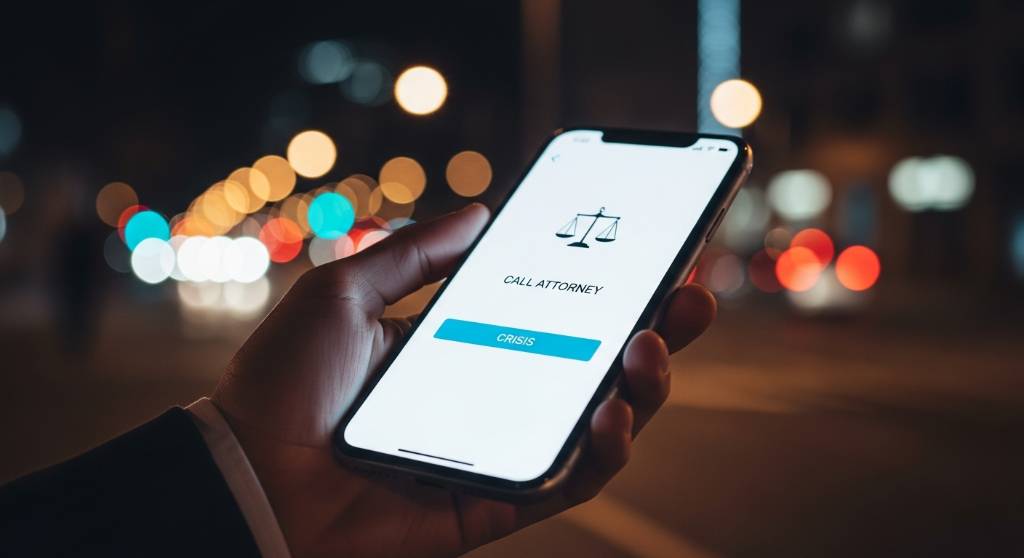
Over 70% of legal searches occur on mobile devices, often from hospital waiting rooms or the side of the road. A site that looks beautiful on a 27-inch monitor but fails on an iPhone is a liability.
When a user is in crisis, aesthetic beauty is often just friction. Speed is the ultimate form of empathy.
The Friday Night 405 Freeway Panic
We consulted for a criminal defense firm in West Los Angeles that had invested heavily in a cinematic website. It featured a 4K video background of the partners walking down a courthouse hallway in slow motion. On a desktop in a fiber-optic office, it looked award-winning.
The analytics told a different story. Their target keyword, DUI Lawyer Los Angeles, saw 65% of traffic arriving between 10:00 PM Friday and 3:00 AM Saturday. Their potential clients were standing on the shoulder of the 405 freeway with spotty cellular reception.
That 4K video choked the mobile load time to 12 seconds. We replaced the video with a static, high-contrast navy blue screen carrying only two elements: a headline (Arrested? We Can Be There in 30 Minutes) and a sticky Call Now button. The conversion rate jumped from 1.2% to 8.5% overnight.
Ego-Centric vs. Client-Centric Design
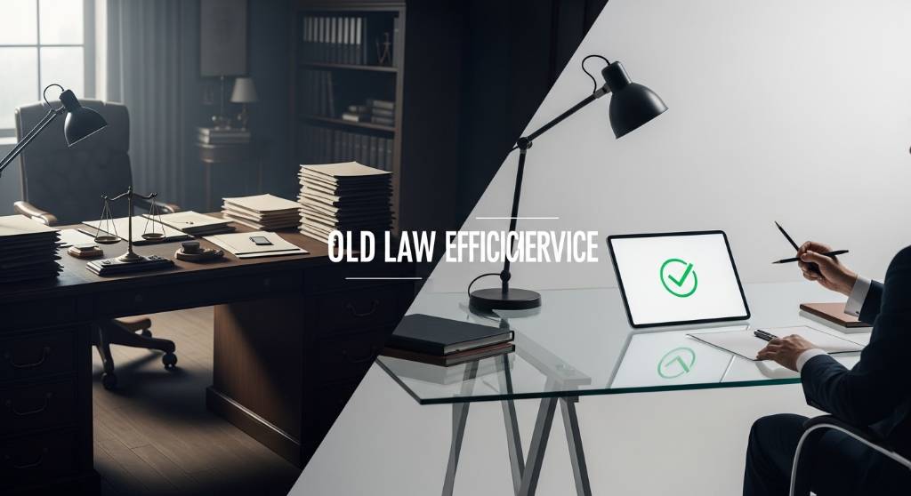
The traditional prestige model of law firm website design serves the attorney's ego. The de-escalation model serves the client's relief. The difference in performance is measurable.
| Feature | Prestige Design (Ego-Based) | De-Escalation Design (Client-Based) |
|---|---|---|
| Navigation | Jargon (Litigation, Jurisprudence) | Plain English (Car Accidents, Divorce) |
| Hero Image | Lawyer in suit, arms crossed | Empathetic imagery or value prop |
| Content Tone | We are aggressive fighters | We handle the fight so you can heal |
| Speed | Slow (heavy video assets) | Fast (Core Web Vitals optimized) |
The Legalese Bounce Factor
In an A/B test for a San Diego family law firm, we pitted ego-centric language against de-escalation language. The firm was struggling to break into the top three results because its menu used terms like Marital Dissolution and Paternity Actions.
Heat-mapping showed users pogo-sticking: they landed on the page, got lost in the jargon, and bounced back to Google. We renamed the navigation to match how people actually describe their situation, so Marital Dissolution became Divorce Help and Paternity Actions became Child Custody.
Impact on Bounce Rate
We did not change the law. We lowered the cognitive load required to hire them. That shift moved the firm from position 8 to position 2 in search results.
Google, E-E-A-T, and AI Readiness
For broader digital marketing services in California, it helps to understand that Google reads site speed and structure as trust signals. A slow site adds stress to the visit, and Google interprets that poor experience as a lack of authority.
The Local Ghost Problem
We worked with a personal injury firm in Sacramento that was essentially invisible for local searches. The content was good, but the site used generic stock photos of skylines that could have been New York or Chicago.
To an algorithm, the firm was a ghost. Google could not confidently tie it to the Sacramento entity graph. So we went hyper-local:
- Visual localization: replaced stock photos with images of the Sacramento County Superior Court and the I-5 interchange.
- Schema injection: added
LocalBusinessschema referencing their specific latitude and longitude. - Map embeds: embedded a live Google Map relative to the nearest hospital.
Within 60 days, they moved from not ranked to position 6. Signaling we know this city earned trust before anyone read a word of the copy.
Common Myths in Legal Marketing
Myth: I need a slow-motion video of me walking.
Reality: it slows down largest contentful paint. Visitors rarely watch it, and it works against you on mobile.
Myth: my website needs to look expensive.
Reality: it needs to look professional. Expensive design tends to create distance, while accessible design creates connection.
Myth: SEO is just about keywords.
Reality: legal marketing runs on trust. If the experience feels broken, Google watches how people behave and adjusts accordingly.
Your Website is Your First Case Manager
The goal of a law firm website is not to win a design award. It is to act as a digital sedative for a stressed-out client: answer the questions, take the fear down a notch, and leave a frictionless path to a consultation.
Audit your site speed. Open your own site on your phone. Rewrite the hero text so it is about the reader's relief rather than your record. If you want a second opinion on any of it, ask us for a de-escalation UX audit.
Frequently Asked Questions
What is the Emotional De-Escalation Framework in law firm web design?
It is a design approach that treats the visitor as someone under acute stress rather than as a shopper comparing credentials. Instead of leading with accolades and prestige cues, the site works to lower cognitive load: plain-language navigation, pages that load quickly on a phone, calm color and spacing, and one obvious way to reach a person. Relief comes first, persuasion second.
What are the essential pages for a law firm website?
Most firms need a homepage, a page for each practice area, attorney bios, a contact page, an about page, and somewhere for reviews or testimonials. A blog gives you room to answer the questions people actually type into a search box. Case results and an FAQ page help as well, provided every claim on them is something your firm can substantiate.
How important is mobile responsiveness for a law firm website?
It matters more than almost anything else on the list. Legal searches skew heavily toward phones, and many of them happen from a waiting room, a police station, or the roadside on a weak connection. Google also indexes the mobile version of a page first, so the phone experience is the one being judged. Test on a real handset, not a resized browser window.
Should a law firm use a video background on its homepage?
Rarely, and almost never on mobile. A large video is usually the heaviest asset on the page, and it delays the largest contentful paint, which is the moment a visitor finally sees something useful. Most people in a hurry never watch it. A static image or a solid color with a headline and a visible call button gives the same impression at a fraction of the weight.
How should a law firm write its website navigation labels?
Write them the way a worried person would say them out loud. Divorce Help reads more clearly than Marital Dissolution, and Child Custody reads more clearly than Paternity Actions. The legal terminology can still live inside the page for accuracy and for search, but the menu itself should never make someone guess which link matches the situation they are in.
How often should a law firm redesign its website?
There is no fixed schedule. Rebuild when the site stops doing its job: slow pages on mobile, navigation nobody understands, a layout that will not stretch to fit a new practice area, or a content system your team cannot update without help. Between rebuilds, steady fixes to speed, copy, and calls to action usually do more good than another full redesign.